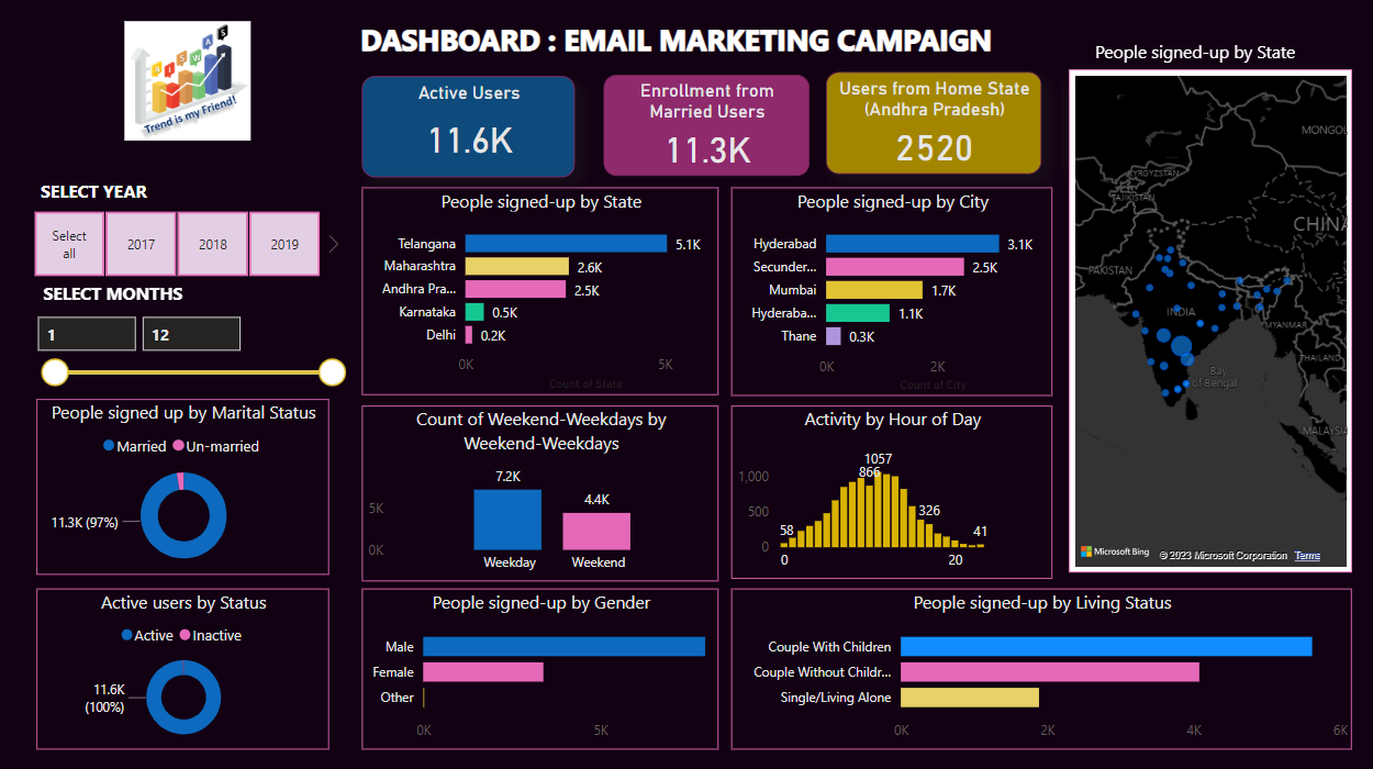
E-mail Marketing Campaign Dashboard (Snapshot)

Objective: Create an Email Marketing Campaign Dashboard in Power BI to track key performance indicators (KPIs) and visualize user data from 2017 to 2020, facilitating data-driven decision-making.
Project Highlights: Visuals Built: (Plesae sign in to your Power BI account to access the interactive embedded dashboard.
I. Comprehensive Email Marketing Dashboard.
II. Multi-year data analysis (2017-2020).
III. Interactive visuals for user demographics and behavior.
IV. Geographic representation of user sign-ups.
V. Insights to optimize email marketing strategies.
I. KPIs:
o Active Users, Enrollment from Married Users, Users from Home State (Displayed in Slice tiles format for 2017-2020).
II. Donut Charts:
o Marital Status Distribution of Sign-ups.
o Active User Status Distribution.
III. Bar Chart:
o Gender Distribution of Sign-ups.
o Count of Sign-ups on Weekends vs. Weekdays.
o User Sign-ups by State.
o User Sign-ups by City.
o Activity by Hour of the Day.
o Living Status Distribution of Users.
IV. Slider with Filter(value) box:
o Months selection
V. Interactive Map:
o User Sign-ups by State.
If you don't possess an account, the snapshot below provides a decent representation of the Project Management Dashboard.)
